Designing flight booking: reducing complexity in decision-heavy journeys

Flight booking looks simple on the surface.
Search.
Compare.
Select.
Pay.
But once you start analyzing it, it becomes clear that this is not a transactional flow.
It’s a decision system.
The challenge
The goal of this challenge was to redesign part of a flight booking experience for a fictional airline.
At first glance, the task seemed straightforward:
improve the process of finding and purchasing a flight.
But very quickly, the focus shifted.
This wasn’t just about designing screens.
It was about understanding how people make decisions under constraints.
And more importantly, how small frictions accumulate into cognitive overload.
Understanding two different intents
To frame the problem, I worked with two distinct user scenarios:
Federica — a student planning her first solo trip across Europe
Limited budget
High flexibility
Strong focus on finding the best deal
Cristóbal — planning a romantic getaway
Time-constrained
Looking for something specific
More sensitive to convenience than absolute price
Both users are booking flights.
But they are not solving the same problem.
And designing a single flow for both means navigating that tension.
Mapping the journey
The journey was structured across key phases:
Inspiration
Search
Exploration
Evaluation
Purchase
Post-purchase
At each stage, I mapped:
Actions
Emotional states
Frictions
Touchpoints
Opportunities
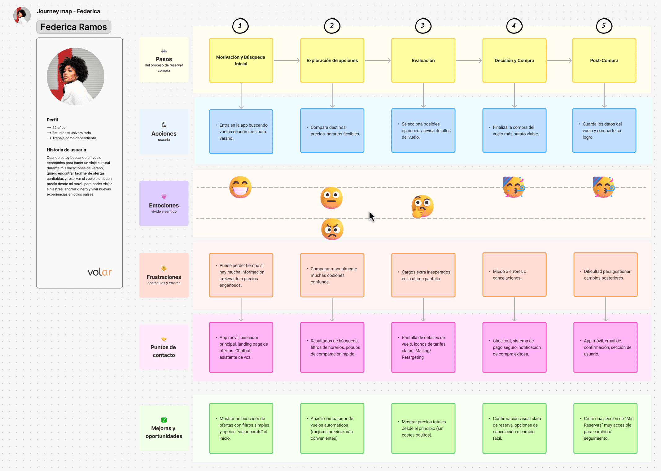
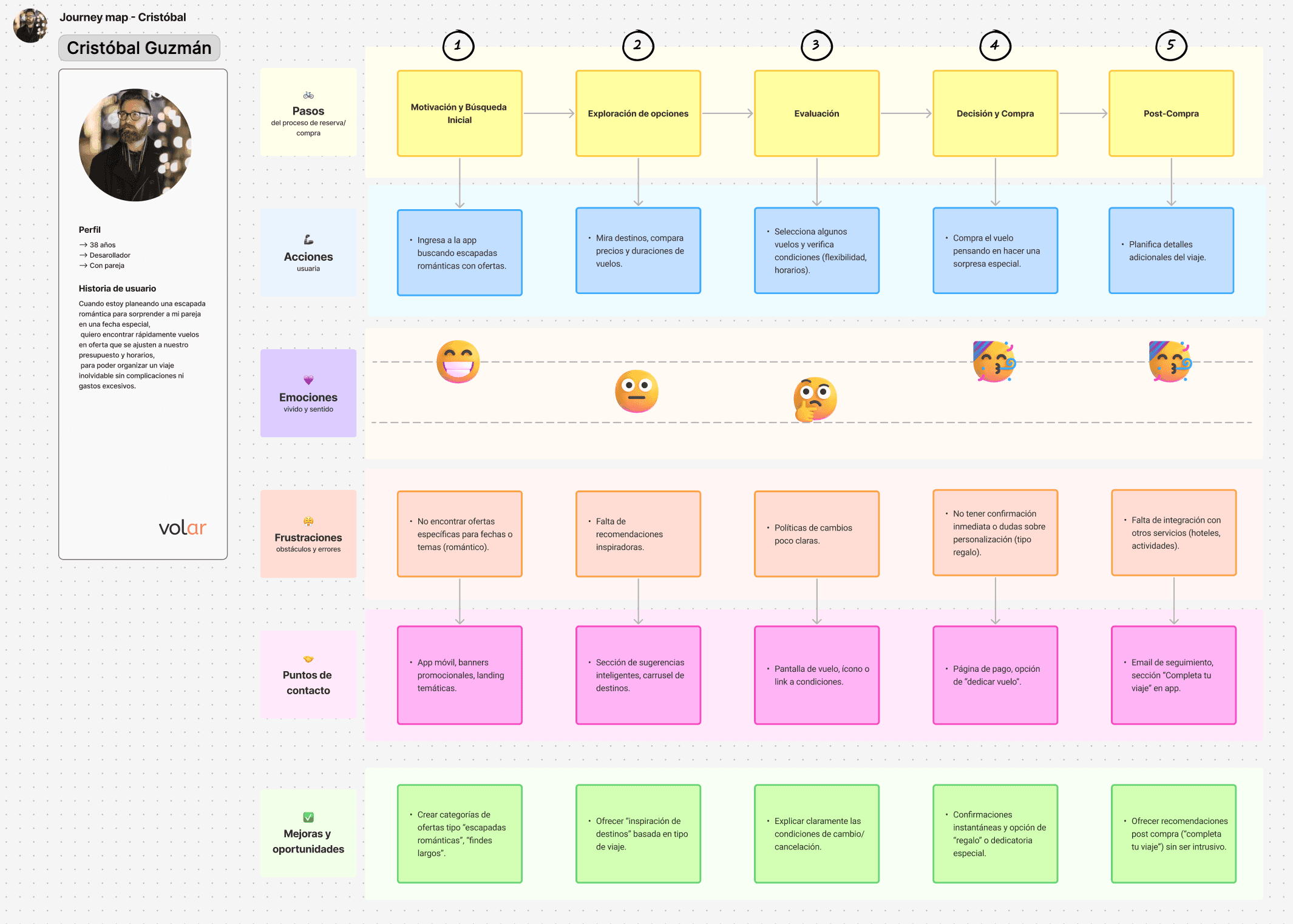
What emerged was not a usability issue in the traditional sense.
It was something deeper.
The real problem: cognitive overload
The biggest friction wasn’t visual.
It wasn’t even functional.
It was cognitive.
Users are forced to make too many micro-decisions in sequence:
Comparing prices vs. schedules
Understanding what’s included and what’s not
Evaluating trade-offs without clear context
Anticipating hidden costs
While mapping the journey, one thing became clear:
The moments of highest friction were not where the interface was broken —
but where the user had to think the most.
This creates a subtle but powerful effect:
Decision fatigue.
And when that happens, users either:
choose quickly without confidence
or abandon the process entirely
Key frictions identified
Across both journeys, several recurring issues appeared:
Lack of price transparency early in the process
Difficulty comparing options in a meaningful way
Hidden or late-disclosed costs
Overloaded result screens
Uncertainty around conditions (changes, cancellations)
These are not isolated problems.
They compound.
Designing by reducing, not adding
Instead of adding features, the approach focused on reducing friction.
Three main directions guided the solution:
1. Make price understandable from the start
Users shouldn’t have to “discover” the real price.
Clear total cost from the first interaction
Reduced ambiguity around fees
Less mental calculation
2. Support comparison, not just exploration
Most interfaces show options.
Few help users compare them effectively.
Structured comparison logic
Highlighting meaningful differences
Reducing the effort required to evaluate alternatives
3. Reduce decision load across the flow
Instead of concentrating complexity at key moments:
Distribute decisions progressively
Remove unnecessary steps
Simplify interactions without oversimplifying the experience
From complexity to structure
The key shift in this project was not visual.
It was structural.
Fewer decisions per step
Clearer information hierarchy
Better alignment between user intent and available options
The interface became simpler —
but only because the system behind it was clearer.
What this project revealed
This challenge reinforced something important:
Designing flows like this is not about optimizing screens.
It’s about managing complexity.
Especially in systems where:
users don’t have full information
decisions have trade-offs
and uncertainty is part of the experience
Final thought
Flight booking is not just a usability problem.
It’s a decision-making problem.
And the role of design is not only to make things usable —
but to make decisions easier to take.
date published
Feb 1, 2026
reading time
5 min


