Adolfo Domínguez — rethinking the shopping experience
Improving the online shopping journey while preserving the brand’s identity.
problem
Shopping for fashion online requires more than finding an appealing product. Users need to understand fit, materials, sizing and product differences before feeling confident enough to purchase. Adolfo Domínguez has a distinctive brand identity, but this character was not always translated clearly into the digital shopping experience. A heuristic evaluation identified opportunities to improve catalogue navigation, product comparison and the hierarchy of key information. As a result, users may need to interpret the experience on their own rather than feeling guided from discovery to purchase, creating friction and uncertainty at important moments of the journey. This case study is based on heuristic analysis and informed design judgement, without access to internal analytics or customer data.
solution
The experience was redesigned to create a clearer and more guided journey from product discovery to purchase. The objective was to reduce unnecessary effort while preserving the distinctive identity of Adolfo Domínguez. Navigation, catalogue structure and information hierarchy were simplified to help users explore the collection and understand the differences between products more easily. Key details such as fit, materials, sizing and availability were made more visible at the moments when they were most relevant. The redesign also connected editorial storytelling with functional product information, creating a more coherent transition between inspiration and shopping. The result is a more intuitive digital experience designed to support confident decisions while expressing the character and values of the brand.
Clothes are not content. They are made to be worn.
Digital fashion has become an endless stream of images.
Products appear, compete for attention and disappear with the next scroll. But a garment cannot be understood in a second. Its value lives in the fabric, the shape, the movement and the way it becomes part of someone’s life.
This redesign explores a slower and more intentional way of discovering fashion.
Instead of displaying more, the experience reveals what matters — helping users move beyond appearance to understand each garment before choosing it.
Less scrolling. More seeing.
Context
Fashion ecommerce is increasingly built around speed.
Endless product grids, constant promotions and image-led browsing encourage users to move quickly from one garment to the next. But choosing clothes still requires understanding details that are difficult to communicate through a screen — fit, texture, movement, materials and how a piece might become part of everyday life.
For Adolfo Domínguez, this tension is especially relevant. The brand is built around timeless design, lasting materials and a more considered relationship with fashion. The opportunity was not to slow down the purchase, but to make every step more intentional — connecting discovery, product understanding and decision-making within a clearer digital journey.

Reading the shopping journey
An expert review of how the experience supports — or interrupts — the decisions users make before buying.
To understand the current experience, I reviewed the core mobile journey as a sequence of decisions rather than a collection of screens.
The analysis followed the transition from discovering a garment to understanding it, choosing a size and committing to the purchase.
At each stage, I examined what the interface made clear, what users still had to infer and whether they had enough information to move forward with confidence.

Current experience
Easy too see. Hard to understand.
The experience gives users access to a broad and visually expressive catalogue. However, seeing a garment is only the beginning of the decision.
To evaluate it, users still need to connect separate pieces of information about silhouette, fabric, fit, sizing and use. The content exists, but the meaning often has to be assembled by the user.
What begins as visual attraction can therefore become uncertainty when the journey moves closer to purchase.
Decision gaps
01 — VISIBILITY WITHOUT DIFFERENTIATION
Products are easy to access, but the differences between similar garments are not always easy to interpret.
Names, images and attributes describe each piece individually, while comparison still depends heavily on the user’s own visual judgement.
Implication
Users can browse the collection without necessarily knowing where to focus.
02 — INFORMATION WITHOUT SYNTHESIS
Fit, composition, measurements and sizing information may be available, but they appear as separate inputs.
Users must combine them on their own to answer a much simpler question: How is this garment likely to fit me?
Implication
Access to information does not automatically create confidence.
03 — MEANING AFTER ATTRACTION
Some of the details that explain the value of a garment — its construction, material behaviour, care or longevity — are discovered later in the journey.
By then, users may already have judged the product primarily through photography and price.
Implication
The reasons to choose a garment are not always visible when interest is first formed.
Key insight
Discovery creates desire. Understanding creates confidence.
The challenge was not to show more products or add more information.
It was to close the distance between what users could see and what they needed to understand before choosing.
Design principles
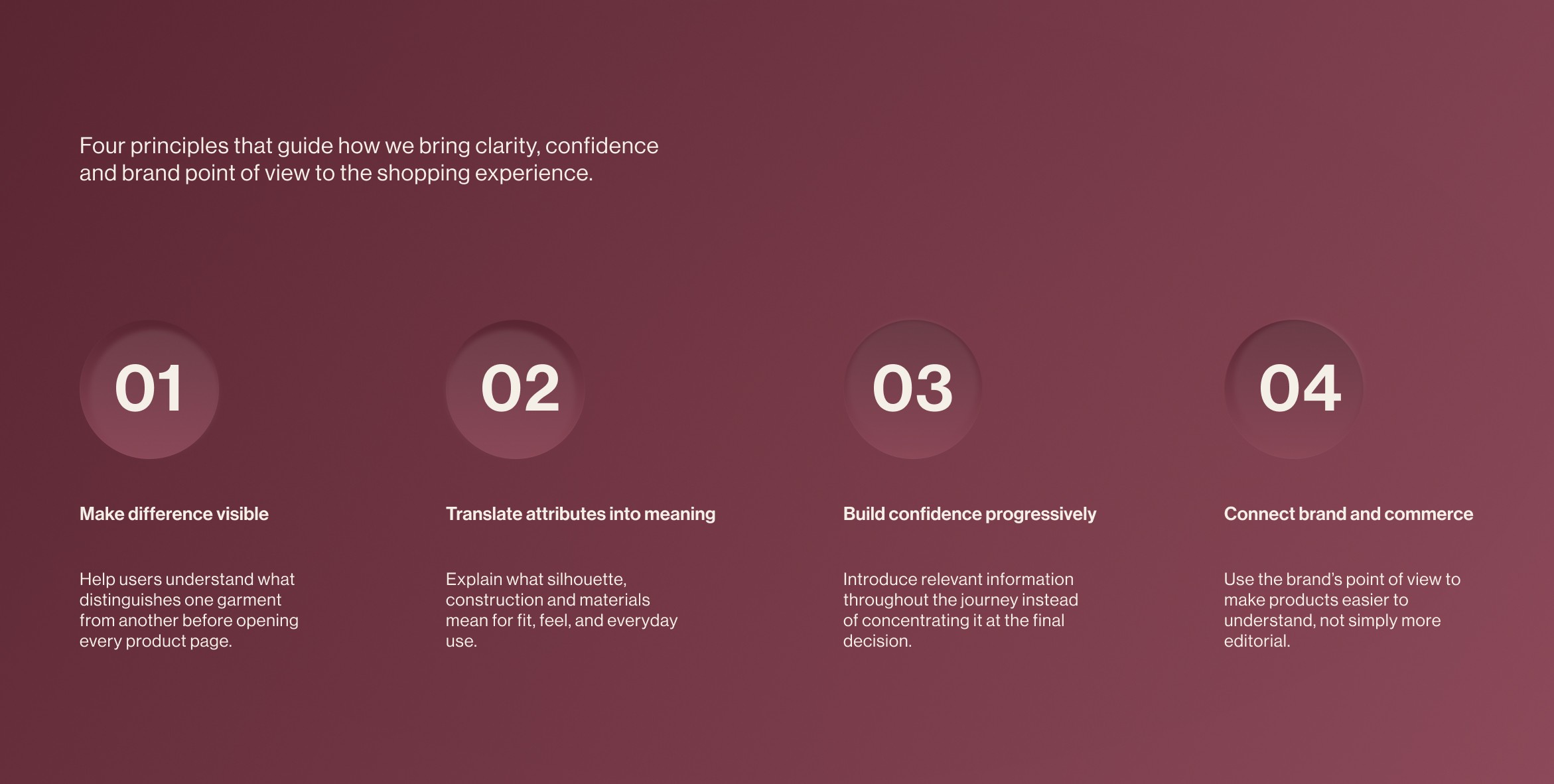
A shopping journey built around understanding
From visual interest to informed choice.
The redesign focuses on the moments where users move from seeing a garment to deciding whether it is right for them.
Rather than adding more content or functionality, the experience reorganises existing information around the questions users need to answer throughout the journey.
The new direction is structured around three connected actions: discovering products with greater context, understanding each garment beyond its image, and choosing with less uncertainty.
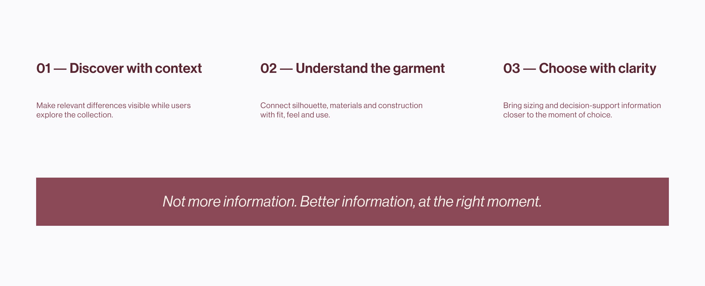
Turning product information into decision support
A clearer path from browsing to choosing.
The redesigned journey brings product meaning closer to the moments when users need it.
Rather than treating the catalogue, product page and size selection as separate screens, the experience was designed as a connected decision system. Each stage answers a different question and prepares users for the next one.
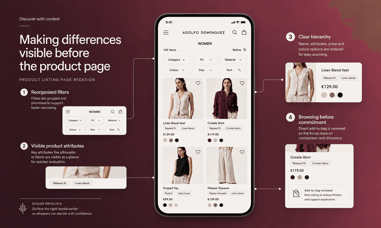
Making differences visible before the product page
Product discovery should help users do more than scan images and prices. It should provide enough context to understand why one garment may be more relevant than another.
The redesigned catalogue introduces clearer product attributes, stronger filtering and more informative cards, allowing users to narrow the collection without opening multiple product pages.
A clearer catalogue hierarchy
Categories, filters and sorting were reorganised to reduce competing actions and make the current selection easier to understand.
Product cards with more meaning
Relevant attributes such as silhouette, material or fit are surfaced directly within the catalogue, helping users distinguish between visually similar garments.
Exploration before commitment
Size selection and purchase actions are moved away from the initial browsing surface, allowing the catalogue to focus on comparison and discovery rather than premature conversion.
The catalogue becomes a place to evaluate, not just a place to scroll.
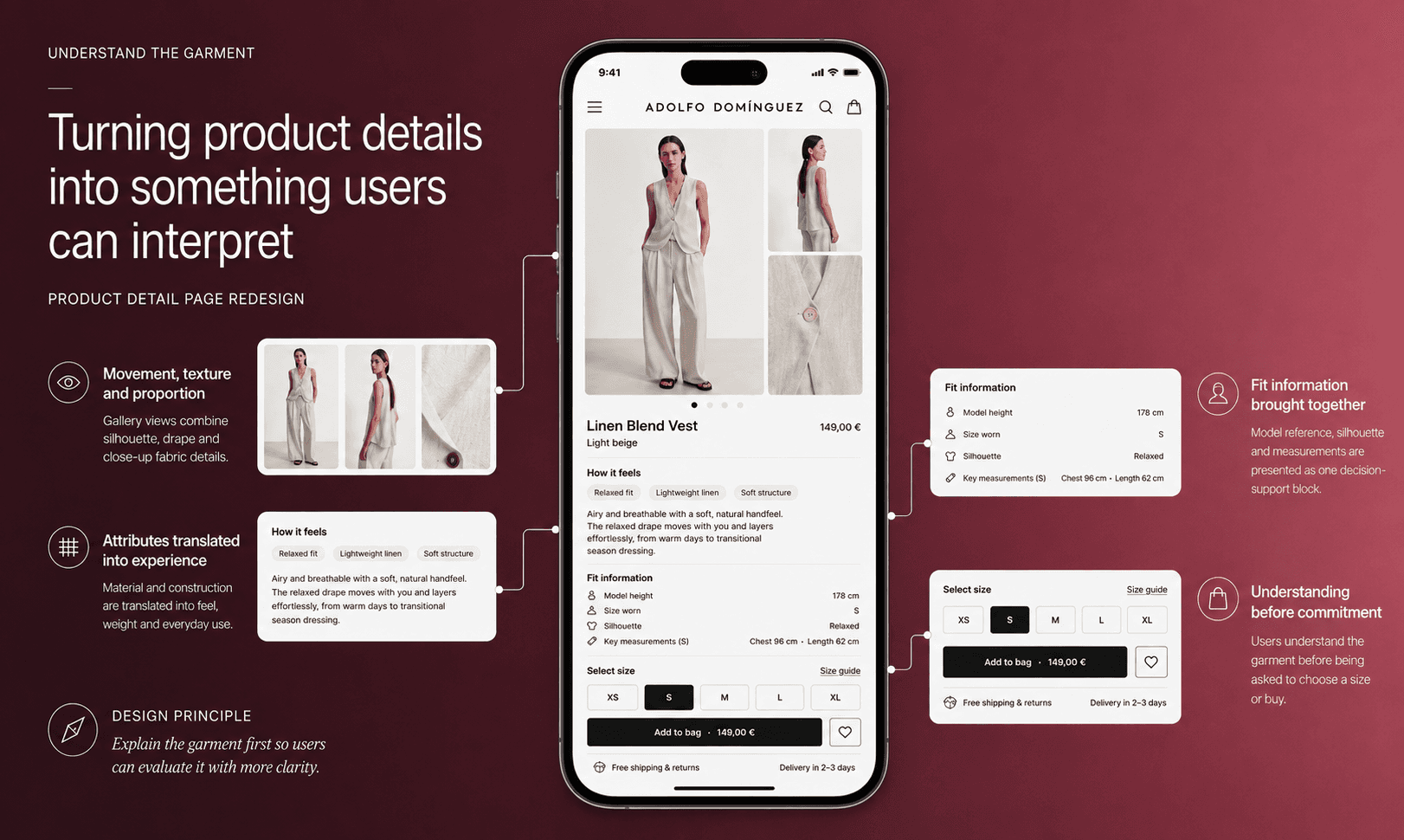
Understand the garment
Turning product details into something users can interpret. From isolated attributes to a clearer picture of the garment.
A product page should do more than list specifications. It should help users imagine how a garment will fit, feel and behave before they can see it in person.
The redesigned product page brings together silhouette, material, movement and sizing within a clearer hierarchy. Instead of forcing users to combine separate pieces of information, the experience translates product attributes into practical meaning at the moment of evaluation.
01 — Show the garment in context
Product imagery combines full silhouettes, movement and close-up details, helping users understand proportion, drape and texture.
02 — Explain what attributes mean
Material and construction details are translated into tangible qualities such as weight, feel, flexibility, care and everyday use.
03 — Make fit easier to interpret
Fit information, model reference and garment measurements are brought together instead of appearing as separate data points.
04 — Reveal value before commitment
The details that explain why the garment is distinctive become visible before users select a size or add it to the bag.
The product page moves from describing the garment to helping users understand it.
Choose with clarity
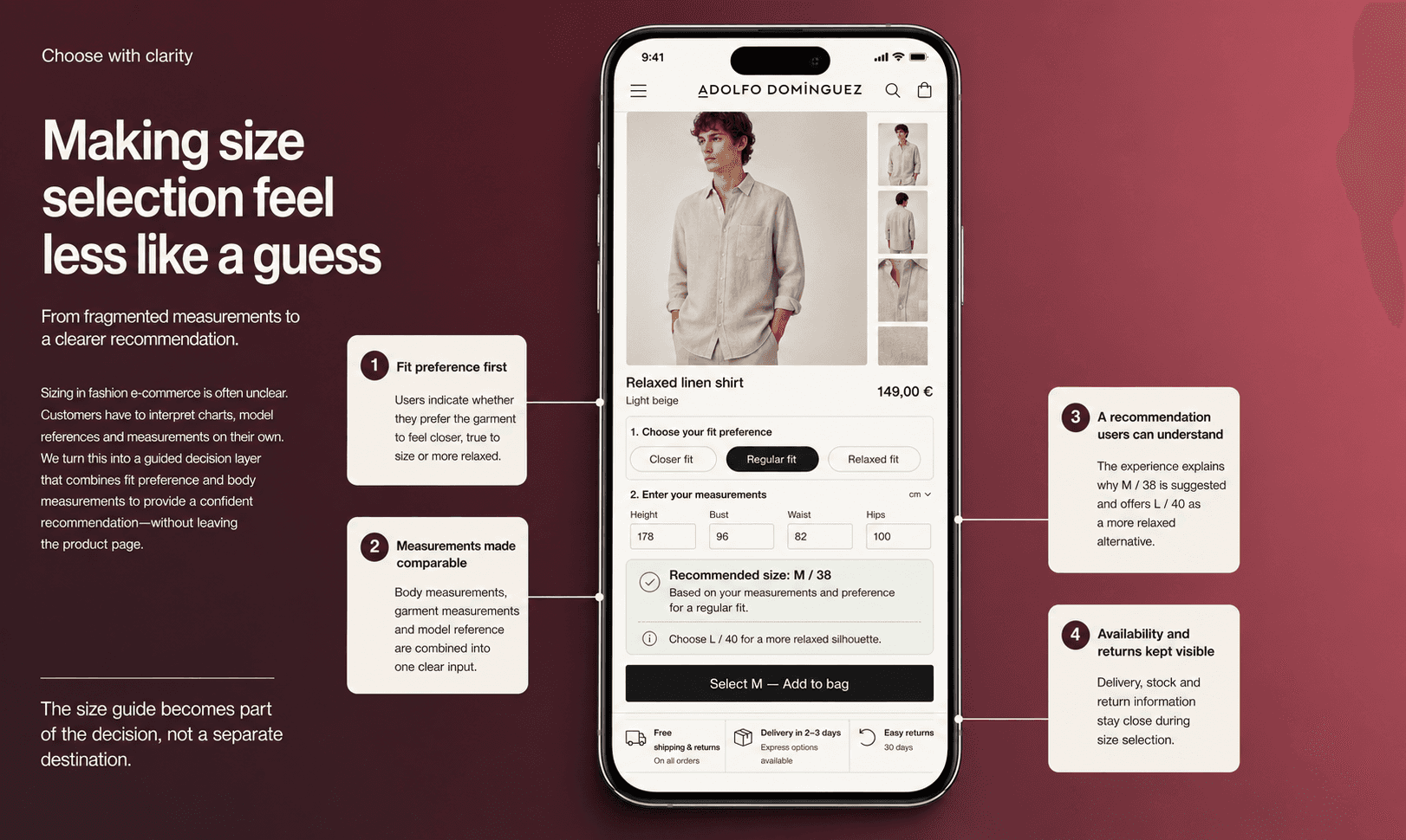
Making size selection feel less like a guess. From fragmented measurements to a clearer recommendation.
Choosing a size is one of the highest-friction moments in fashion ecommerce. Users are often given charts, model references and garment measurements, but still have to interpret how those inputs apply to their own body and preferred fit.
The redesigned experience brings this information into a single decision layer. Instead of sending users away from the product page, it helps them compare their measurements, understand the intended fit and select a size with greater clarity.
01 — Start with fit preference
Users can indicate whether they prefer the garment to feel closer, true to size or more relaxed.
02 — Turn measurements into guidance
Body measurements, garment measurements and model references are combined into one recommendation rather than shown as disconnected data.
03 — Explain the recommendation
The experience shows why a size is suggested, allowing users to review the reasoning instead of relying on an unexplained result-
04 — Keep practical information close
Availability, delivery and return conditions remain visible during size selection, reducing uncertainty before purchase.
The size guide becomes part of the decision, not a separate destination.
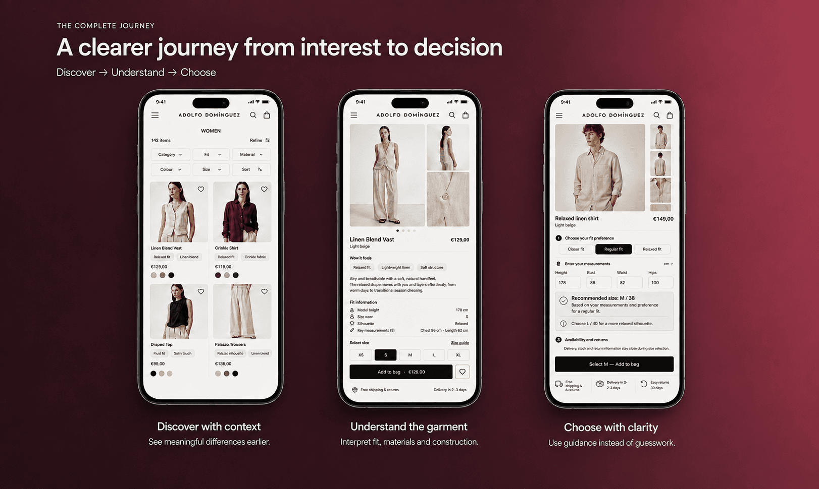
The complete journey
A clearer journey from interest to decision.
The final experience connects product discovery, garment understanding and size selection within one continuous journey.
Each stage reveals the information users need for the decision in front of them — without overwhelming the experience or losing the brand’s editorial character.
Expected impact
This conceptual redesign was developed without access to internal analytics or live customer data. Its impact should therefore be understood as a set of product hypotheses to validate, rather than measured business outcomes.
Faster product differentiation
Users should be able to narrow the catalogue and identify relevant garments with less exploration.Stronger product understanding
Fit, materials and construction should become easier to interpret before size selection.Less uncertainty at purchase
Integrated sizing guidance should reduce hesitation when choosing a size and adding a product to the bag.
What I would measure
Filter engagement · Product page progression · Size guidance usage · Add-to-bag rate · Size-related returns
Reflection: What this project reinforced
Fashion ecommerce does not necessarily need more information. It needs a clearer relationship between information and decision-making.
The main design challenge was preserving the emotional value of discovery while introducing enough structure to help users evaluate each garment.
Without behavioural data or usability testing, the next step would be to prototype the complete journey and validate whether the proposed hierarchy genuinely improves comprehension, sizing confidence and progression towards purchase.
From displaying garments to helping people choose them.
year
2026
timeframe
1 week
tools
Figma
category
UI/UX