Drift — designed for focus in a world built for distraction
Reducing friction. Improving focus through design.
problem
Starting should be effortless. But it rarely is. When users open a product to focus, they already have a clear intention: begin. Yet interfaces interrupt that moment with small decisions — choose, adjust, configure. Individually minor, together they create just enough friction to break momentum. Focus isn’t a feature users activate. It’s a fragile state they try to enter. Every extra decision shifts attention from doing to managing the tool. When the path to start isn’t immediate, the product stops supporting focus — and starts competing with it.
solution
If the problem isn’t what the product offers, but the effort required to access it, then the solution is not to add — but to remove. Drift is designed to make starting feel almost automatic. Instead of asking users to configure their focus, the experience reduces the moment to a single, clear action. No setup. No visible complexity. No competing paths. The interface doesn’t present options to evaluate, but a direction to follow. The system is built around momentum. Each interaction guides the user forward through subtle transitions, avoiding unnecessary decisions or interruptions. Control still exists — but stays in the background. Accessible when needed, invisible when not. The goal isn’t to reduce functionality, but to reduce the effort to begin. So starting doesn’t require intention. It just happens.
Drift is not a tool. It’s a state.
Focus shouldn’t feel like something you activate.
It should feel like something you enter.
Drift explores what happens when the interface steps back —
allowing the user to move forward without interruption.
A visual system built around calm and continuity
The interface is intentionally minimal:
Dark UI to reduce noise
Soft gradients to create depth without distraction
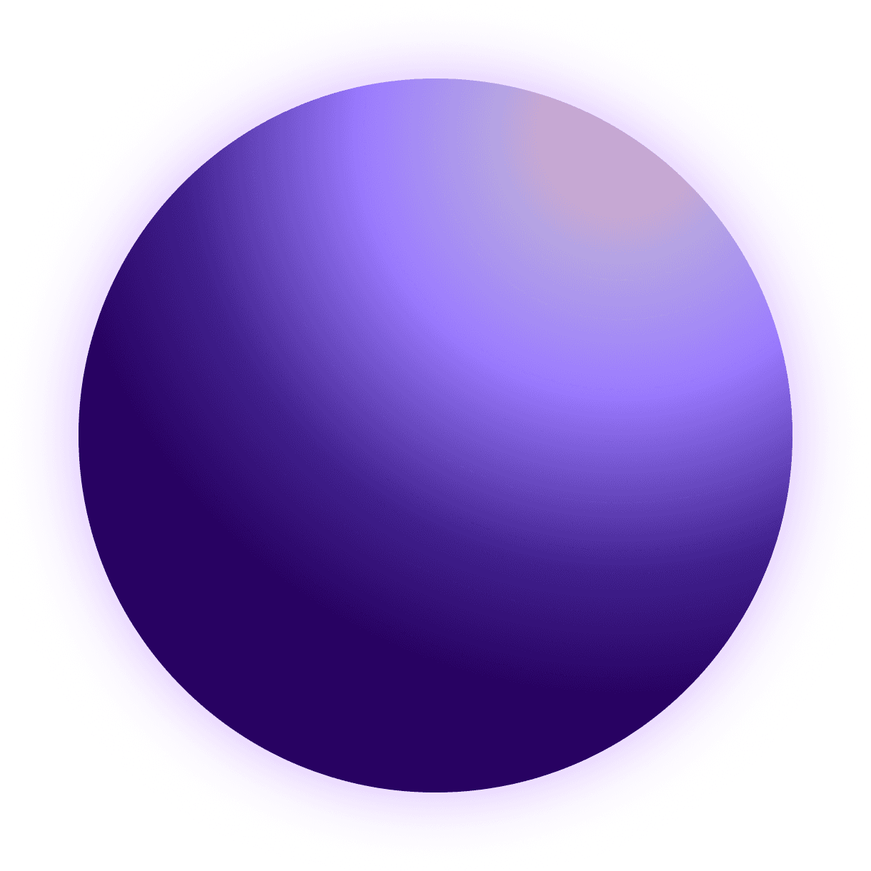
A single central element: the orb
The orb is not just visual — it’s the core interaction.
It replaces buttons, menus, and navigation with a single, continuous surface.
Less language. More flow.
Drift reduces the need to read.
No instructions. No system language. Only what’s necessary to move forward.
Short labels
Minimal hierarchy
Clear intent
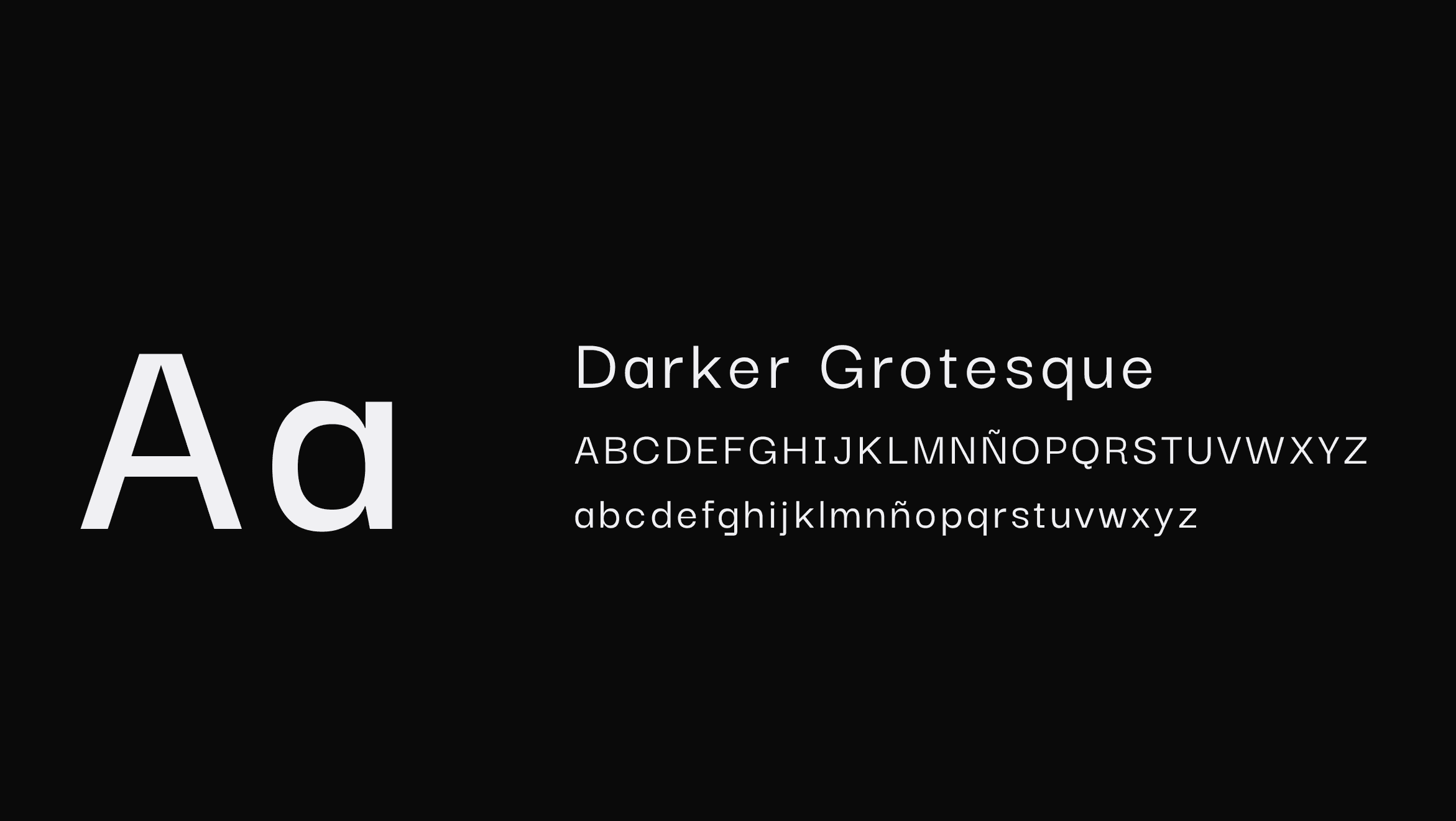
Typography isn’t used to explain — but to keep rhythm and maintain focus.
Designed to step back
Drift’s visual system removes anything that competes for attention.
The logo stays neutral.
The typography stays quiet.
Nothing tries to stand out — so focus can.
Context
We live in systems designed to break focus.
Constant notifications. Endless feeds. Continuous switching.
Focus is no longer the default — it’s something users have to fight for.
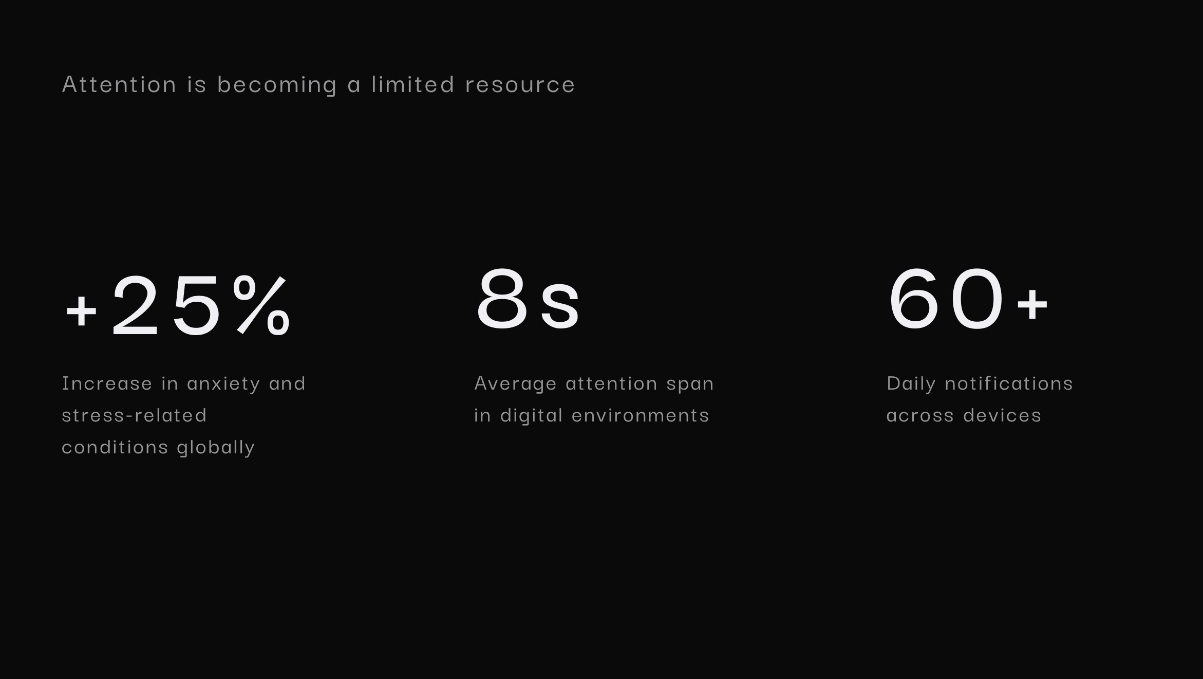
This shift is measurable:
+25% increase in anxiety and stress-related conditions
1 in 4 people affected
~8 seconds average attention span in digital contexts
60+ daily interruptions across devices
Attention is fragmented.
The challenge isn’t adding more tools — but removing the effort to start.
Hypothesis
IIf attention is fragmented, asking users to decide before they begin adds friction.
What if focus didn’t require configuration —
but less decision-making?
Drift reduces visible options and guides interaction through a clear flow.
Less cognitive load at the start → faster entry, sustained momentum, deeper focus.
Rethinking how users enter focus
Most products in this space start the same way: they ask users to decide before anything else happens.
Focus is approached through different models:
Content-driven → choose what to engage with
Goal-oriented → define intention before starting
Tool-based → configure the session first
These approaches offer flexibility and control.
But they also introduce friction at the very beginning.
Before acting, the user has to pause — interpret, decide, configure.
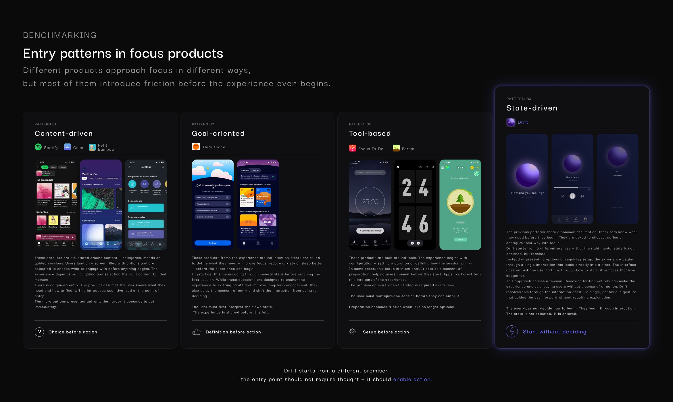
The cost of entry
Across these models, the cost is consistent: users must decide, define, or configure before experiencing any value.
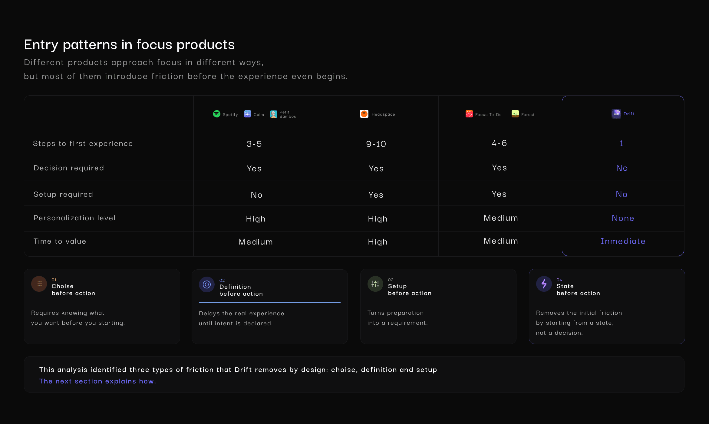
Insight
This reveals three core types of friction:
Choice
Definition
Setup
Drift was designed to remove them by default.
A different starting point
Instead of organizing the experience around content, goals, or tools, Drift removes that initial layer.
The entry point becomes a single interaction — leading directly into a state.
No decisions. No setup. No delay.
Design Principles
01 — Remove decision at entry
No choices. No setup. Starting is immediate.
02 — Reduce cognitive load
The interface minimizes what users need to process.
03 — One interaction → one state
Each action leads to a clear, predictable outcome.
04 — No setup, no configuration
Nothing to adjust before starting.
05 — Guide through interaction
The system is understood by doing — not by reading.
Interaction Model
Entry
A single element invites action. No menus. No decisions.
Transition
The interface responds in real time — reducing noise and guiding focus.
State
The user enters a stable, uninterrupted session.
Exit
Leaving is as simple as entering. No friction, no break in flow.
The interaction is not a step before the experience. It is the experience.
User Flow
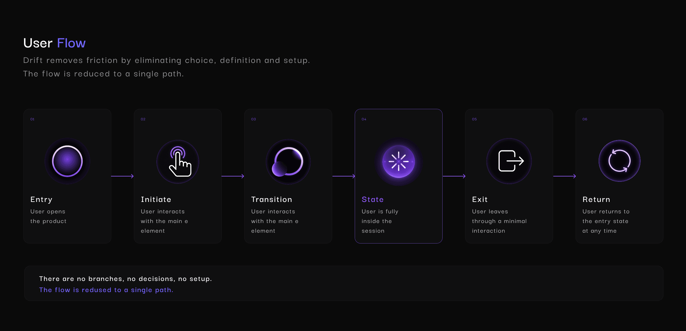
Interaction System
Interaction replaces instruction.
Every response is immediate, continuous, and intentional.
Instant feedback
Fluid transitions
Progressive reduction
Consistent rhythm
No interruptions
The system doesn’t ask. It leads.
The system doesn’t ask what to do. It shows it through interaction.
Key Screens / UI: From intent → focus
A sequence designed to move the user forward — without decisions, without interruption.
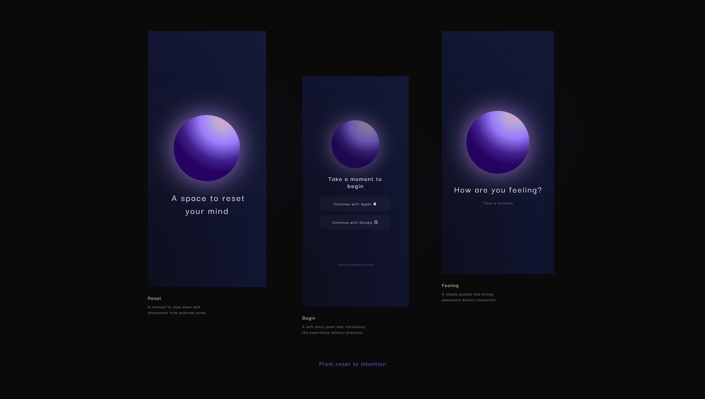
ONBOARDING
The experience doesn’t begin with instructions or decisions — but with a shift in pace.
Instead of asking users to configure or define anything, the onboarding introduces a slower, more intentional rhythm.
Simple prompts create space to pause, moving attention away from noise and into the experience.
ENTRY
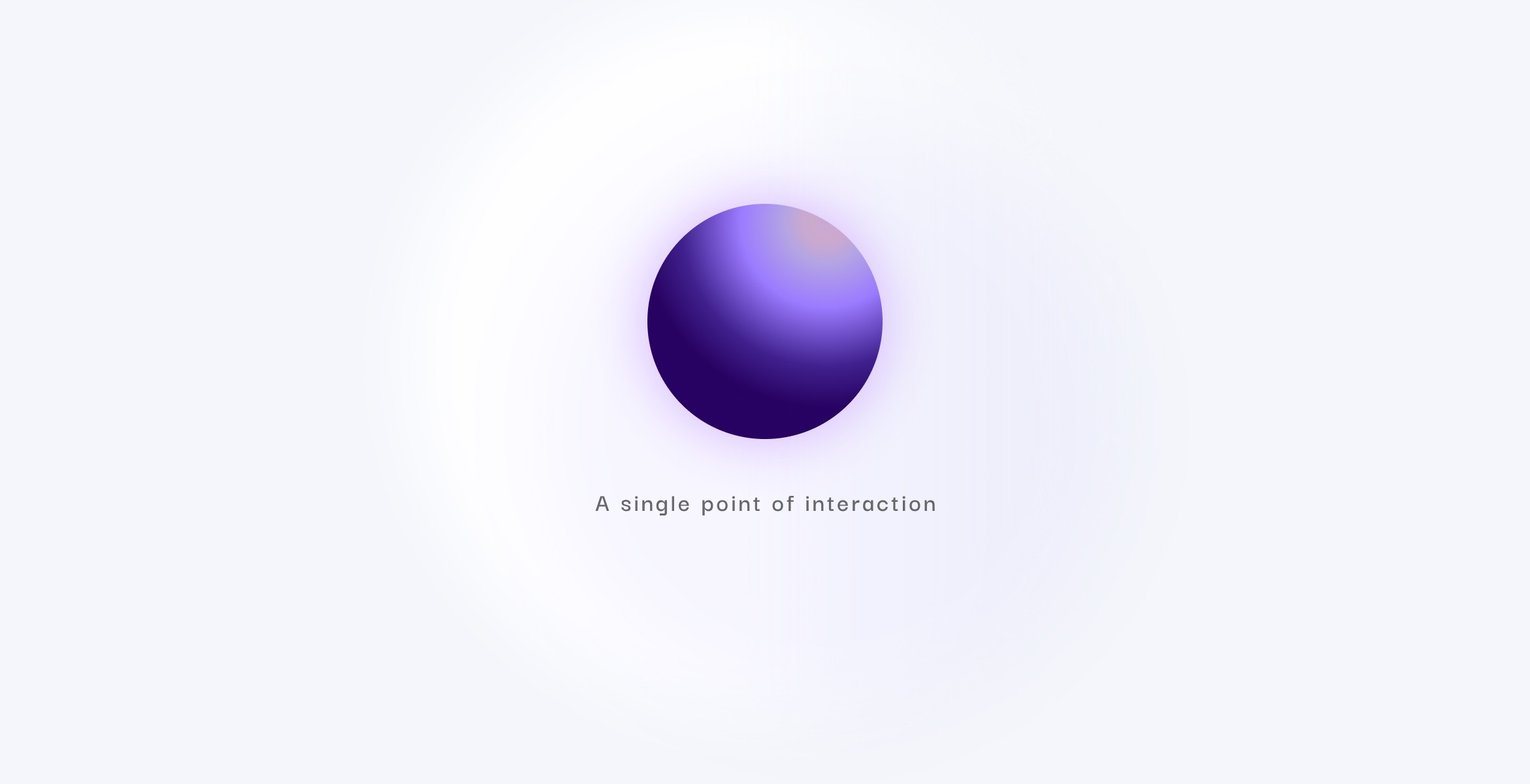
The experience begins by removing everything that isn’t essential.
What remains is a single point of interaction — inviting action without instructions, choices, or friction.
INITIATE
Only a gesture.
No choices. No paths.
The system responds instantly — pulling the user into the experience.
The interaction is reduced to a single gesture — removing friction at the point of entry.
SYSTEM RESPONSE
No output. No confirmation.
The interaction continues.
The interface adapts in real time — the orb, motion, and message reflecting a change in state.
Not to explain it. But to let it be felt.
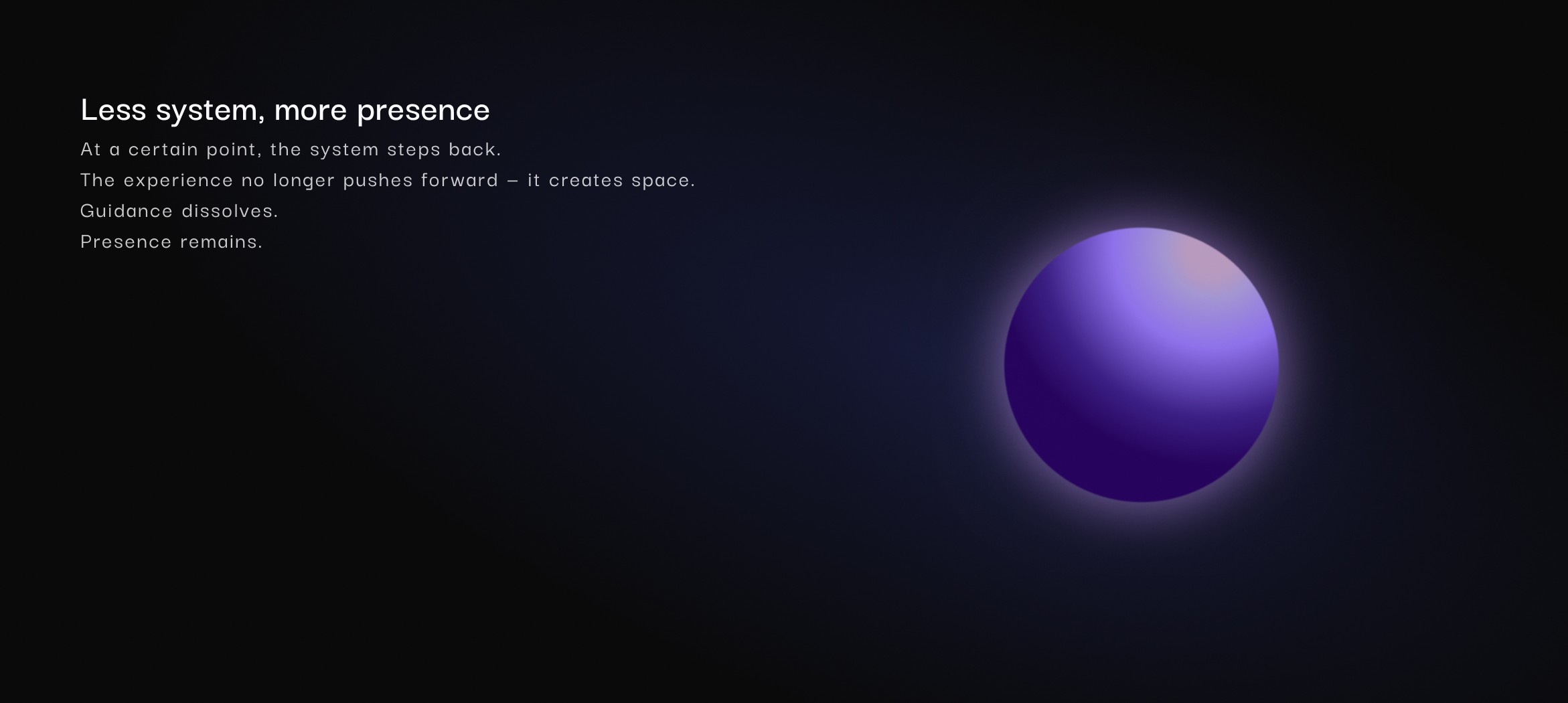
SHIFT IN STATE
From action to state.
The interface fades as focus takes over.
What remains is not interaction — but presence.
The system no longer leads. It supports.
From doing → to being
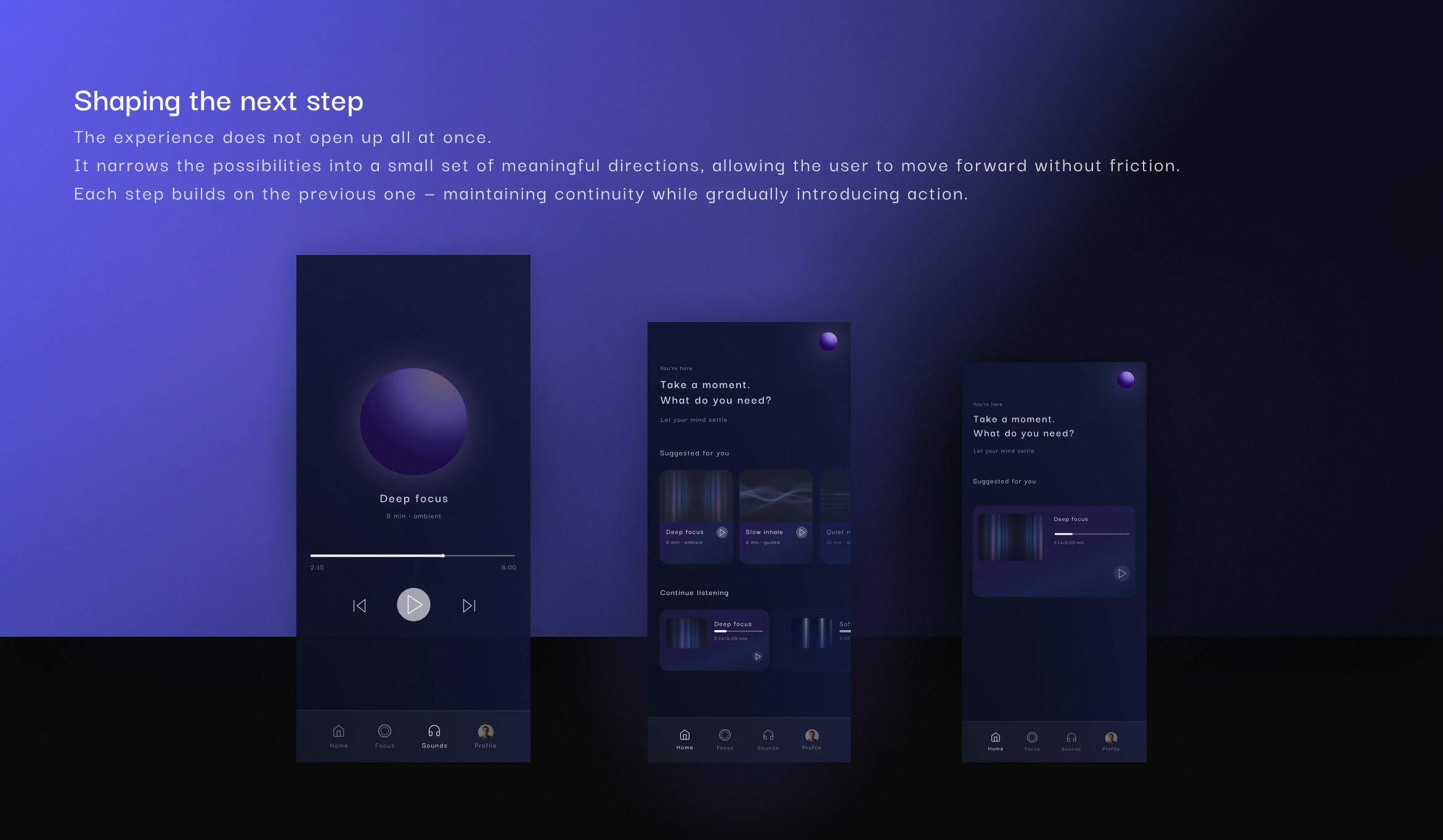
FROM STATE TO ACTION
From presence to direction.
The experience expands with a small set of focused paths — introduced gradually, without breaking flow.
From here, the system no longer guides inward, but supports what comes next.
WHAT THIS TAUGHT ME
Not every problem requires more.
Sometimes, better design comes from removing what’s unnecessary.
Guiding the user isn’t about control — but about knowing when to step back.
The goal isn’t always interaction. Sometimes, it’s space.
year
2026
timeframe
3 days
tools
Figma
category
UI/UX